Color is the single most impactful design decision you'll make for your kitchen backsplash. It ties together your cabinets, countertops, flooring, and appliances into a cohesive space — or, if chosen poorly, creates a visual disconnect that's expensive to fix.
This guide covers the backsplash color trends shaping kitchens in 2026, how to match colors with your existing finishes, and a system that takes the guesswork out of color selection entirely.
2026 Backsplash Color Trends
Warm Neutrals Are Dominating
The cool gray trend that dominated kitchens for a decade is giving way to warmer tones. Think greige (gray-beige), warm taupe, and soft clay. These colors add warmth without committing to a bold statement, and they pair naturally with both white and wood-tone cabinetry.
Deep, Saturated Greens
Forest green, emerald, and sage continue their rise. Green backsplashes work surprisingly well in kitchens because they reference natural materials without feeling trendy. A deep green behind white cabinets creates a grounded, sophisticated look that ages well.
Matte Black and Charcoal
Matte finishes in dark tones are replacing glossy subway tile as the go-to modern backsplash. Black and charcoal create dramatic contrast, especially against light countertops. The key is the matte finish — it absorbs light rather than reflecting it, which prevents the space from feeling harsh.
Terracotta and Rust
Earthy reds and burnt oranges are emerging as accent colors for backsplashes. These tones connect to the broader trend of natural, organic materials in kitchens and work exceptionally well with wood cabinetry and brass hardware.
Metallic Finishes
Brushed gold, copper, and bronze backsplashes are no longer limited to high-end commercial kitchens. Metallic finishes add depth and warmth while reflecting light in ways that make smaller kitchens feel more open.
How to Match Your Backsplash Color
With White Cabinets
White cabinets are the most versatile backdrop. Nearly any backsplash color works, but the best results come from:
- Warm whites and creams for a tonal, layered look
- Bold colors (navy, emerald, black) for high contrast
- Warm metallics (brass, gold) for a luxe feel
Avoid cool grays with warm-toned white cabinets. The temperature mismatch reads as unintentional.
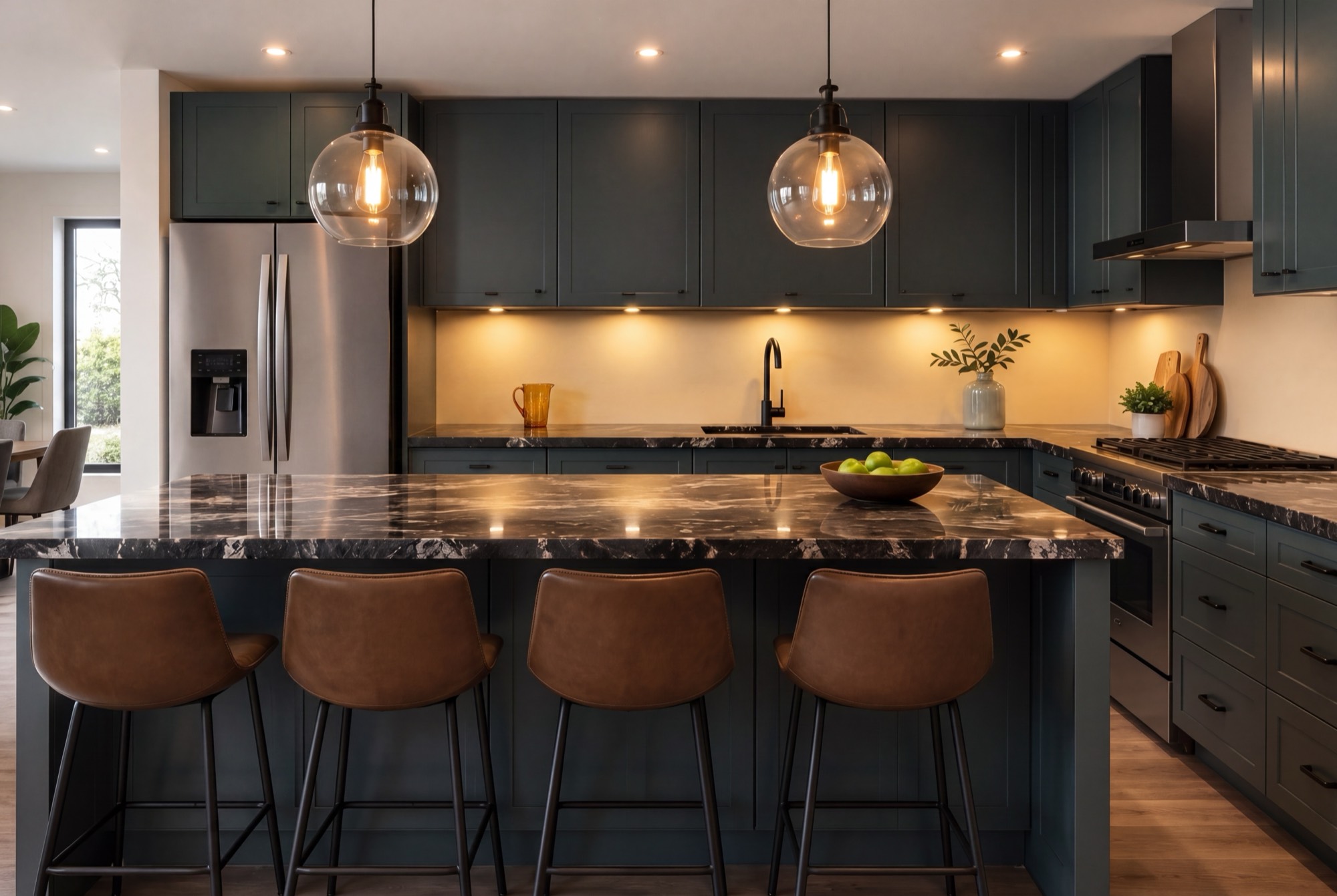
With Wood Cabinets
Wood introduces undertones that your backsplash needs to acknowledge. Light oak pairs with soft greens, warm whites, and muted blues. Walnut and darker woods handle charcoal, deep green, and warm metallics. The rule: don't compete with the wood grain — complement it.
With Dark Cabinets
Dark cabinets (navy, black, espresso) need a backsplash that provides contrast without overwhelming the space. Light neutrals, white, and soft metallics open up the visual field. Alternatively, a tonal match — dark cabinets with a slightly lighter backsplash in the same color family — creates a moody, cohesive look.
With Your Countertop
Your countertop and backsplash share a visual plane, so they need to relate. Pull a secondary color from your countertop's veining or pattern for the backsplash. If your countertop is busy (like granite or bold marble), keep the backsplash simple and solid. If your countertop is plain, the backsplash can carry more visual weight.
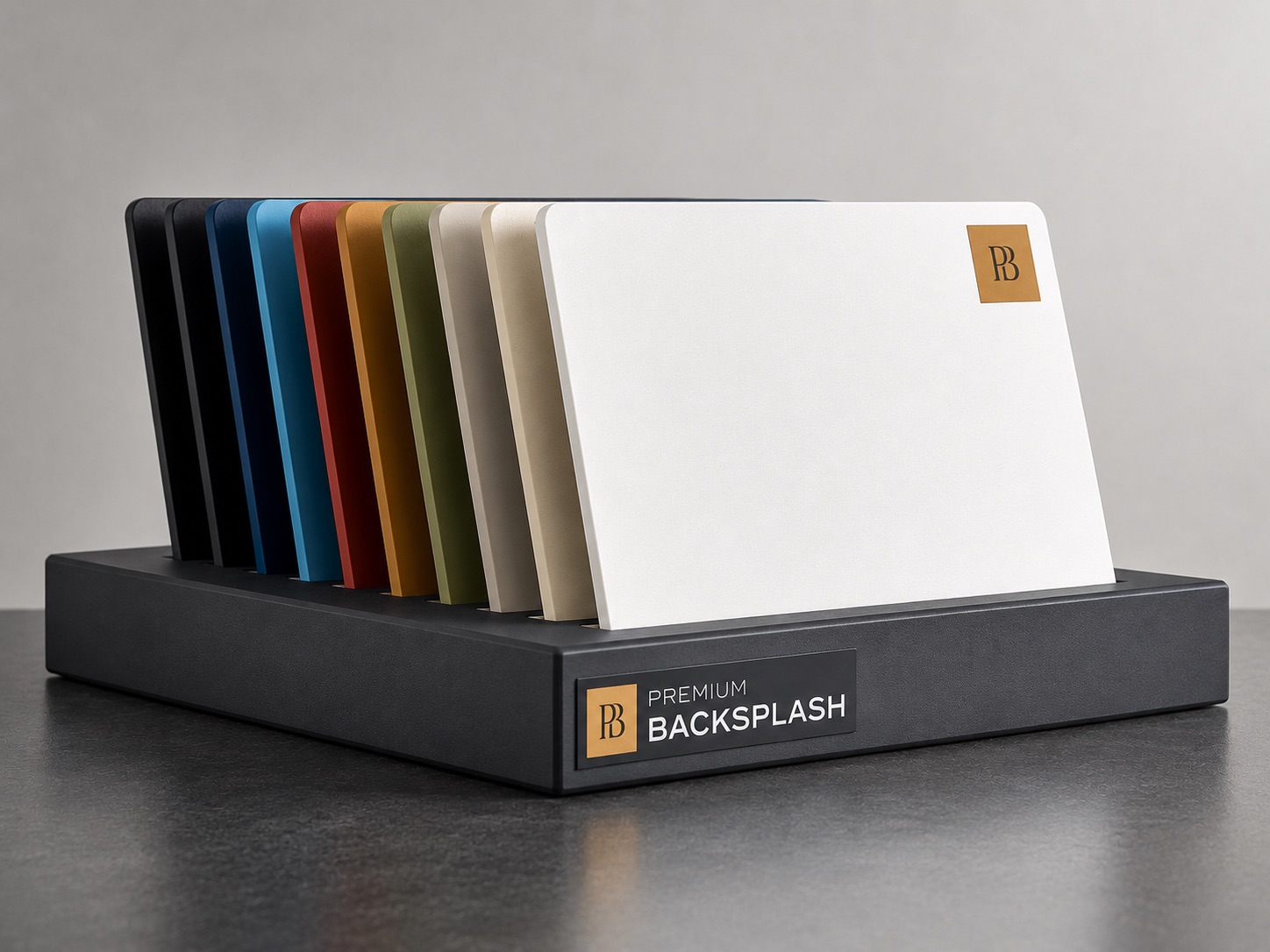
The RAL Color System: Precision Color Selection
Here's where most backsplash materials fall short. Tile manufacturers offer predetermined color palettes — you choose from what's available. If the perfect shade for your kitchen doesn't exist in their catalog, you compromise.
The RAL color system eliminates that problem.
What Is RAL?
RAL is a European color matching system used across industries — architecture, automotive, industrial design, and interior finishes. It defines over 2,500 standardized colors, each with a unique code. RAL 7016 is Anthracite Gray. RAL 6005 is Moss Green. RAL 3009 is Oxide Red.
The system ensures that when you specify a color, you get exactly that color. No batch variation, no "close enough."
Why RAL Matters for Backsplashes
When your backsplash is produced using the RAL system, you can:
- Match any paint color you've already used in your kitchen
- Coordinate precisely with cabinetry, appliances, and fixtures
- Specify custom colors that don't exist in standard tile palettes
- Reorder with confidence knowing the color will be identical
This is particularly powerful for open-concept kitchens where the backsplash color needs to relate to living and dining areas with specific wall colors.
The Aluminum Advantage: Any Color, Any Finish
Traditional backsplash materials limit your color options to what's commercially available. Aluminum backsplash panels break that constraint entirely.
Because aluminum panels are coated rather than fired or dyed, they can be produced in any RAL color, any custom color match, and a range of metallic finishes. Want a backsplash that exactly matches the Benjamin Moore paint on your kitchen island? Provide the color code and the panel is produced to match.
Premium Backsplash, for example, offers their aluminum panels in the full RAL spectrum plus custom color matching. You send them a color reference — a paint chip, a fabric swatch, a pantone code — and they produce panels in that exact shade. They even partner with Jung to produce switch plates and outlet covers in the same color, so your entire backsplash surface is visually uninterrupted.
Finish Options Beyond Color
Color is only part of the equation. Surface finish dramatically affects how a color reads in your kitchen:
- Matte absorbs light and hides fingerprints. Best for dark colors and high-traffic kitchens.
- Satin offers a soft sheen that's easy to clean while maintaining a refined look.
- Metallic adds depth and light reflection. Transforms the backsplash into a design focal point.
- High gloss maximizes light reflection. Works well in smaller kitchens that need visual expansion.
Choosing Your Color: A Practical Framework
If you're overwhelmed by options, use this decision framework:
- Start with what you can't change. Countertops and flooring are expensive to replace. Your backsplash color should complement these fixed elements.
- Decide on contrast level. Do you want the backsplash to blend (low contrast) or pop (high contrast)? Both work — but the intention should be deliberate.
- Test in your lighting. Kitchen lighting dramatically changes color perception. A color that looks perfect in daylight may shift under warm LED downlights. Always test samples in your actual kitchen.
- Consider the long term. Trendy colors are fun but may feel dated in 5 years. If you're choosing a bold color, make sure you love it — not just like it.
- Get a physical sample. Screens lie about color. Always request a physical sample before committing.
Find Your Perfect Backsplash Color
With unlimited color options and precision matching through the RAL system, Premium Backsplash makes it possible to get exactly the color you envision — not the closest available option. Request a free color sample to see how your chosen shade looks in your kitchen's lighting.