The countertop backsplash relationship is the most important visual pairing in any kitchen. Get it right and the entire room feels cohesive. Get it wrong and the kitchen looks disjointed — no matter how nice the individual materials are.
The challenge isn't finding a beautiful countertop or a beautiful backsplash. It's finding the two that work together. Here's how to nail the combination.
The Three Approaches to Matching
1. Complementary (Different but Harmonious)
The most common approach: choose a countertop and backsplash that complement each other without matching exactly. A white quartz countertop with a soft gray tile backsplash, or a butcher block counter with a white subway tile backsplash.
When it works: Most kitchens. Complementary combinations create visual interest and depth.
Risk: Choosing materials that clash in undertone (warm countertop with cool backsplash or vice versa).
2. Matching (Same Material Extended)
Run the same material from countertop up the wall. Quartz, granite, or marble slab extending from the work surface to the upper cabinets creates a seamless, monolithic look.
When it works: Modern and luxury kitchens. Creates dramatic impact.
Risk: Can feel monotonous in large kitchens. Expensive — you're doubling your stone order.
3. Contrasting (Deliberate Opposition)
Choose a backsplash that intentionally contrasts with the countertop. Black countertop with white backsplash. White countertop with bold green or deep blue backsplash. Light wood counters with matte black panels.
When it works: Kitchens that need energy and visual hierarchy. The contrast creates a clear distinction between work surface and wall.
Risk: High contrast can feel harsh without warm elements (wood, brass, plants) to soften it.
Color Matching Guide
White Countertops
White quartz, white marble, and white solid surface are the most popular countertop choices. They pair with almost anything:
- White backsplash — tone-on-tone creates an airy, open feel. Vary the shade or texture to avoid flatness
- Gray backsplash — the safe classic. Works every time
- Blue or green backsplash — adds personality while staying fresh
- Black backsplash — maximum drama. Stunning with good lighting
- Natural wood — warm contrast that prevents the "sterile" feel
Gray Countertops
Gray quartz and concrete countertops are trending. They pair best with:
- White backsplash — brightens the kitchen while letting gray anchor the space
- Dark gray or charcoal backsplash — tonal variation creates sophisticated depth
- Warm metallics — brass or copper hardware bridges gray counters with warm backsplash tones
Black Countertops
Black granite, soapstone, and black quartz create a bold base:
- White backsplash — the classic high-contrast combination
- Light gray backsplash — softer contrast than pure white
- Matte black backsplash — moody, dramatic, best with good lighting
- Warm wood backsplash — softens the darkness significantly
Butcher Block / Wood Countertops
Warm wood counters need careful backsplash pairing:
- White tile or panels — lets the wood be the star
- Soft sage or olive green — natural, organic combination
- Matte black — modern farmhouse aesthetic
- Avoid: busy patterns that compete with wood grain
Marble or Marble-Look Countertops
Veined marble and marble-look quartz have a lot of visual activity:
- Solid-color backsplash — lets marble be the focal point. White, gray, or a color pulled from the veining
- Same marble up the wall — dramatic but expensive. Only works if the veining is bookmatched
- Avoid: patterned tile that competes with marble's natural pattern
The Undertone Rule
This is the single most important principle in countertop backsplash matching: undertones must agree.
Every white has an undertone — warm (cream, yellow, pink) or cool (blue, gray, green). Every gray has an undertone. Even blacks can lean warm or cool.
A warm white countertop with a cool white backsplash will look wrong even though both are "white." The mismatch is subtle but noticeable — like two people singing slightly out of tune.
How to check: Hold your countertop sample against potential backsplash samples in your kitchen's actual lighting (not the showroom). Look at them together, not separately. Natural light and artificial light can shift undertones significantly.
The Custom-Color Advantage
The biggest limitation in countertop backsplash matching is that standard backsplash materials come in standard colors. Your specific countertop might fall between two available tile shades — close to one, but not quite matching either.
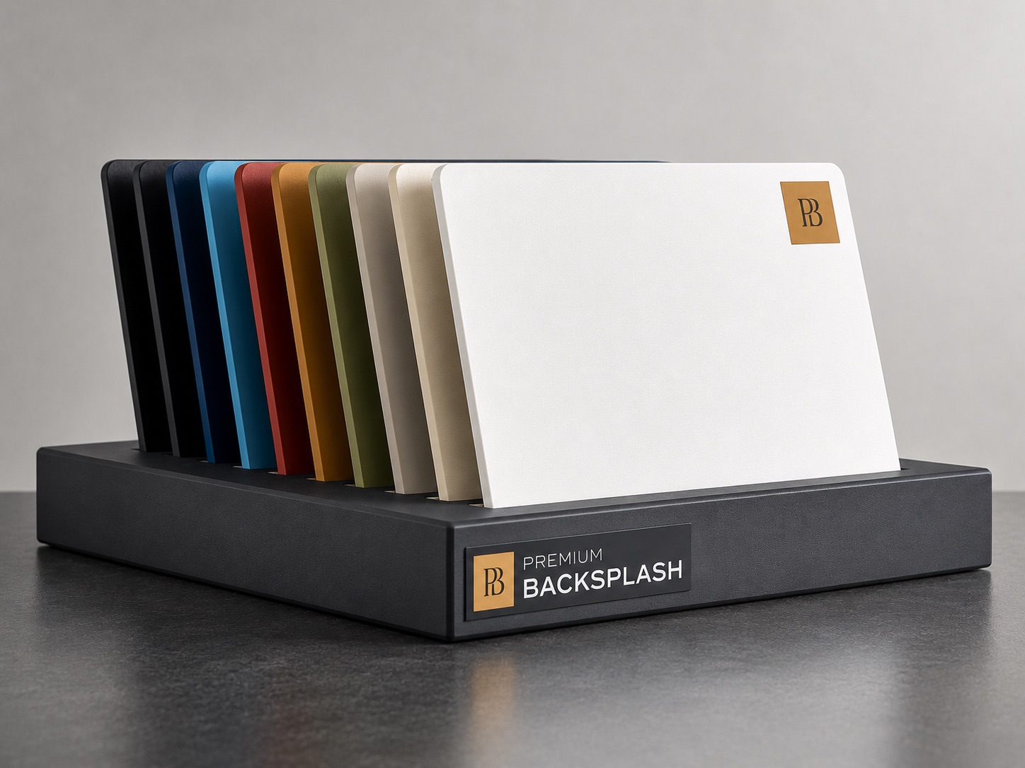
This is where custom-color aluminum panels offer a genuine advantage. Premium Backsplash produces panels in any color from the spectrum, which means you can match your exact countertop tone — or create a precise complementary shade that's custom to your kitchen. No more "close enough" with off-the-shelf tile colors.
For homeowners who've spent weeks choosing the perfect countertop, the ability to get an exact backsplash color match (rather than a approximate one) can be the detail that pulls the entire kitchen together.
Material Pairing Combinations That Work
Quartz Countertop + Subway Tile Backsplash
The reliable, crowd-pleasing combination. Works in every style. Choose a grout color that either disappears (matching grout) or creates a grid (contrasting grout).
Granite Countertop + Solid Panel Backsplash
Busy granite patterns pair best with solid, calm backsplash materials. A single-color panel (white, gray, or a hue pulled from the granite) lets the countertop shine without competition.
Butcher Block + White Seamless Panel
The clean-meets-warm combination that defines modern farmhouse. The white panel keeps things bright; the wood brings warmth.
Marble Countertop + Matching Marble Backsplash
The luxury play. Bookmatched marble from countertop to wall creates a waterfall effect that's breathtaking. Budget accordingly — this is a premium approach.
Concrete Countertop + Matte Black Backsplash
Industrial-modern at its finest. The gray concrete and matte black create a sophisticated, masculine kitchen. Add brass hardware to warm it up.
Common Matching Mistakes
Matching too many materials. Countertop, backsplash, cabinets, and flooring shouldn't all match. Two can coordinate; the others should complement or contrast.
Ignoring the cabinet color. The backsplash sits between the countertop and cabinets. It needs to work with both. Always evaluate the three together.
Shopping for backsplash online without samples. Screens display colors differently. Always get physical samples and evaluate them in your kitchen's lighting.
Choosing backsplash first. The countertop is the more permanent, expensive element. Choose it first, then match the backsplash to it — not the other way around.
The Bottom Line
Your countertop and backsplash are visual partners. The best combinations happen when you start with clear principles (matching undertones, choosing an approach, avoiding competition between busy patterns) and then refine with physical samples in real lighting.
Don't rush this decision — it's one of the few kitchen choices you'll see every single day for years. When the combination clicks, you'll feel it. And every time you walk into the kitchen, that feeling will persist.